The project framework
Client conversations clarified the relationship between the company's work, its own mark and its partner's visual style.

A brand refresh — from documents to a company vehicle.
A new logo and colours for an oil distributor, aligned with its industry and strategic partner.
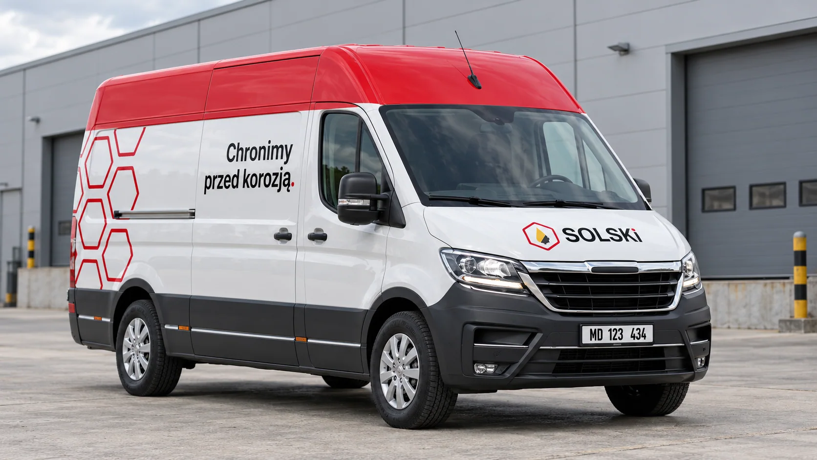
Mockup / visualisationCompany vehicle graphics — visualisation in a warehouse setting.
Logo · Core identity · Colour palette
Project direction and complete design
2025 / Implemented project
The company needed a rebrand reflecting oil distribution and the style of its manufacturer and strategic partner.
I combined a simplified oil drop with part of a cogwheel. Refining the colours and proportions of both forms was a key step.
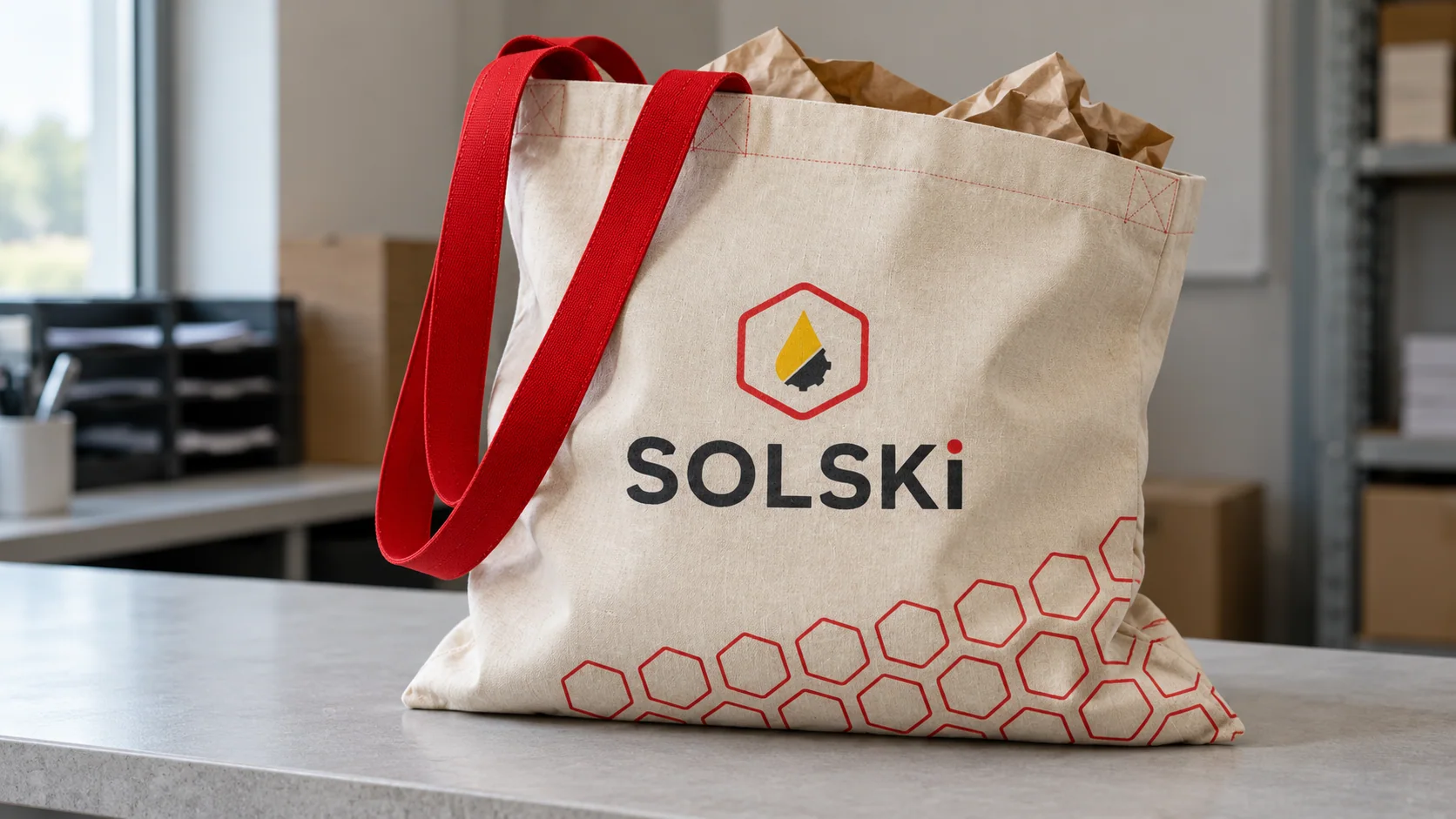
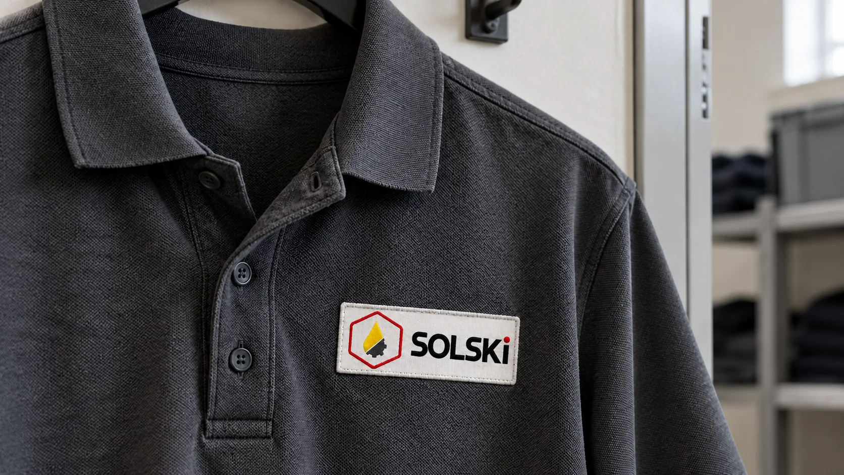
Client conversations clarified the relationship between the company's work, its own mark and its partner's visual style.
Several concepts and mockups helped refine the relationship between the oil drop, cogwheel and colours.
The final design included the new logo and core brand colours.
I created a new logo and colour palette. The company implemented the design.
Tell me what you have in mind. We will discuss the scope, direction and how I can help.
bartlomiej.kempe@gmail.com ↗